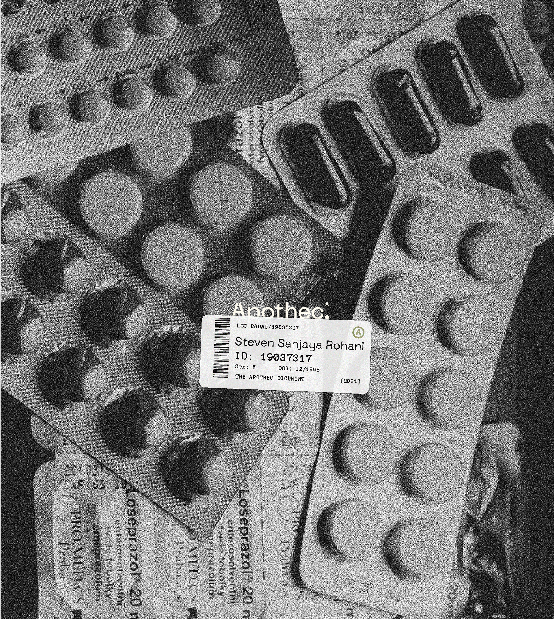
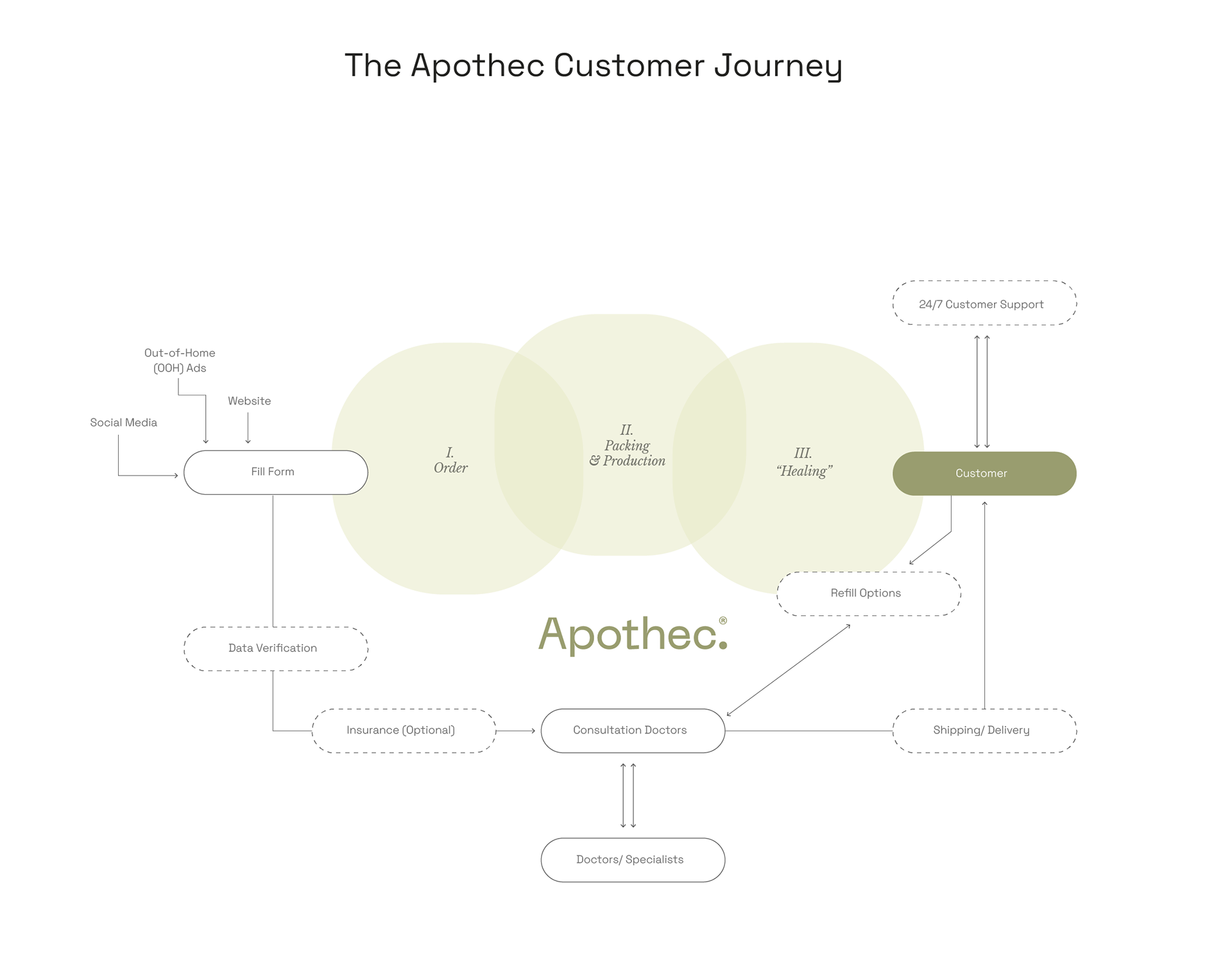
Apothec® is a full-service pharmacy that sorts and delivers medications to your doorstep under coordination and approval from appointed doctors and specialists to approve, transfer and refill prescriptions as per needed.
Brand Identity, Packaging Design, Web Design
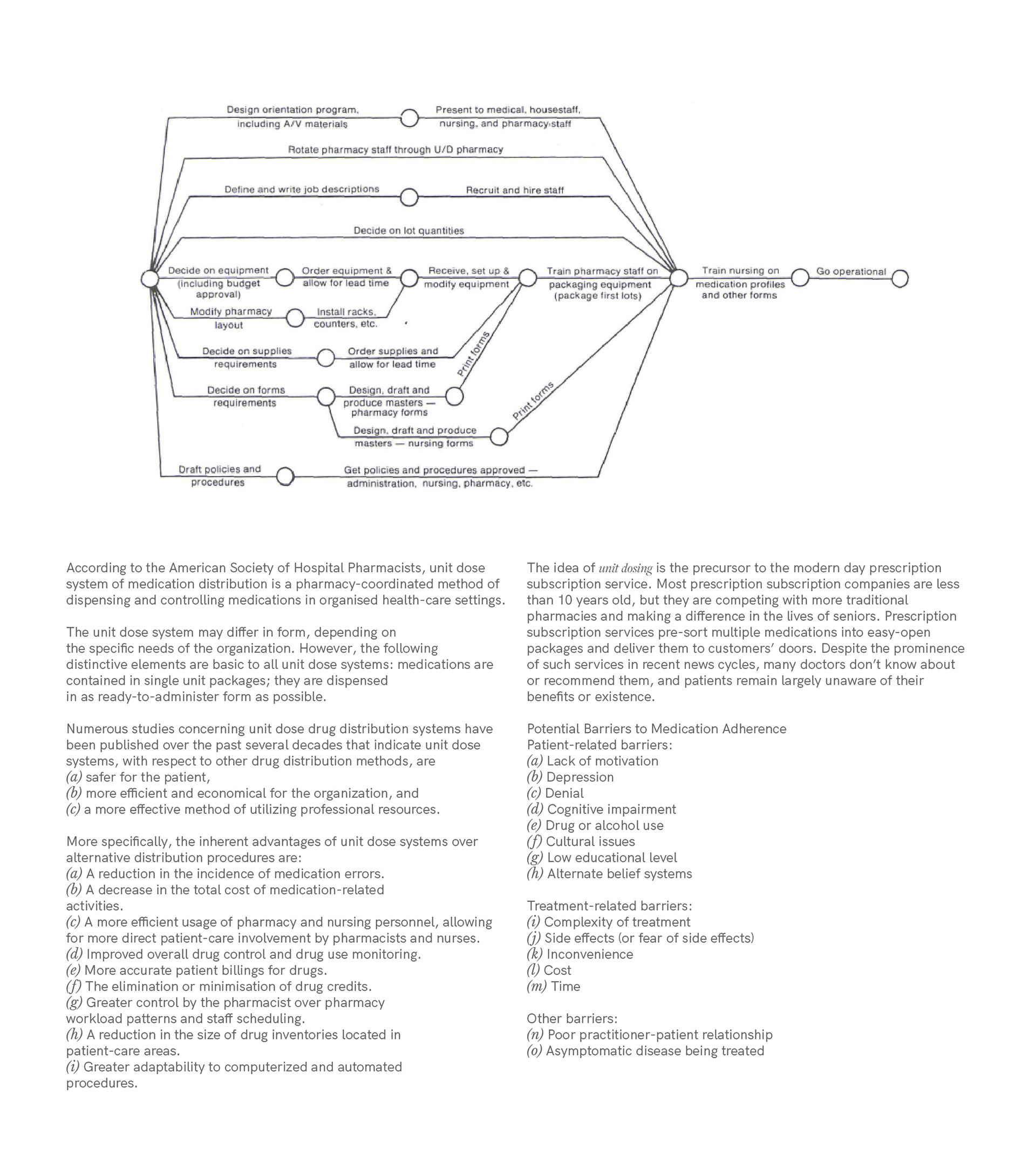
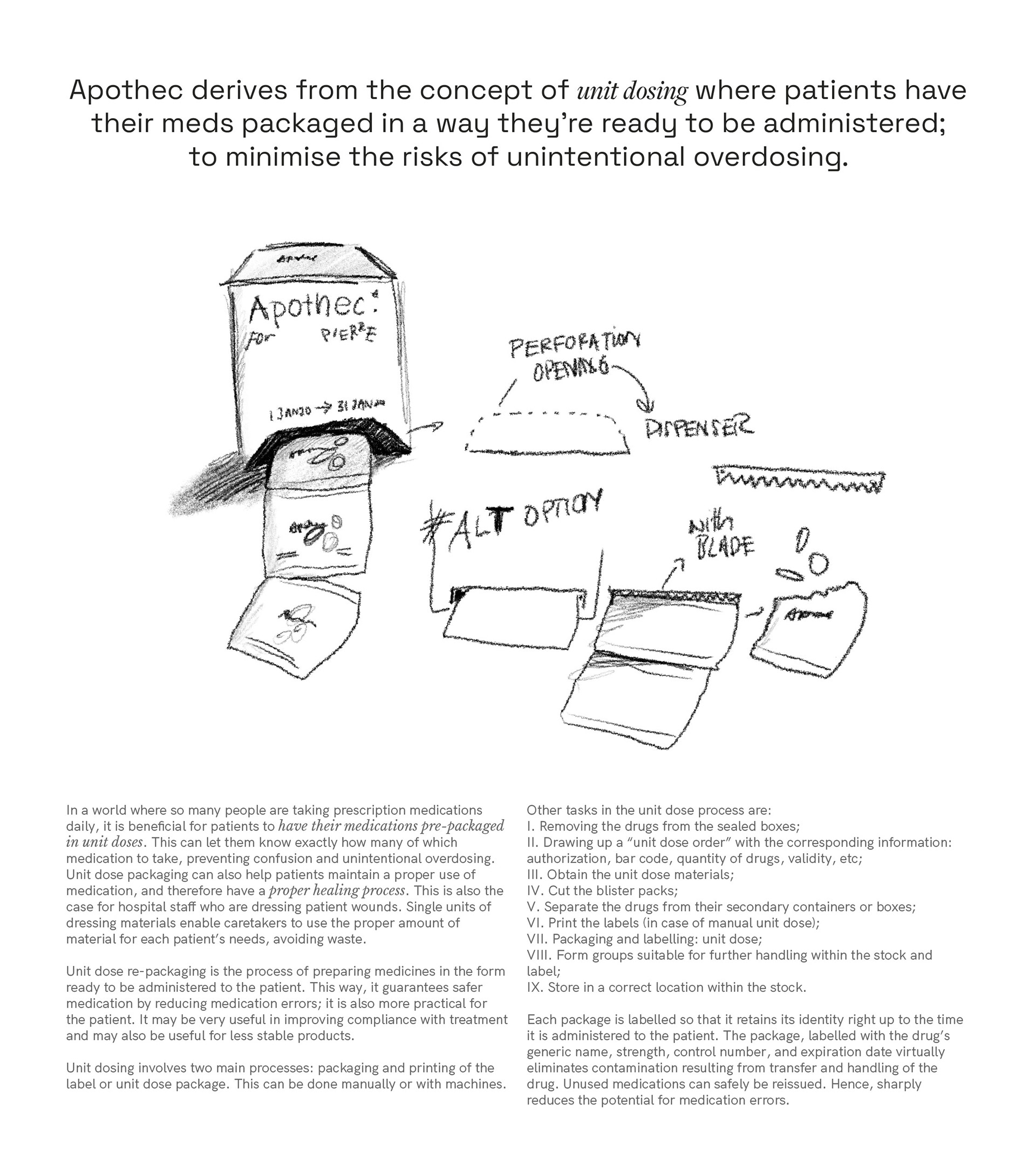
Apothec® derives from the concept of unit dosing where patients have their meds packaged in a way they’re ready to be administered; to minimise the risks of unintentional overdosing.
The brand identity and creative direction for Apothec® mostly involve muted earthy colour tones. The three primary colours of Apothec are:
I. Healing Green - usually associated with herbal, healing and medication.
II. Tusk - a calming and therapeutic lighter hue of Healing Green.
III. Tuatara Black - more of a dark grey that brings visual balance (not full black but dark enough to be legible and not “heavy” on the eyes, used for text prints (especially when legibility is critical in pharmaceutical situations).
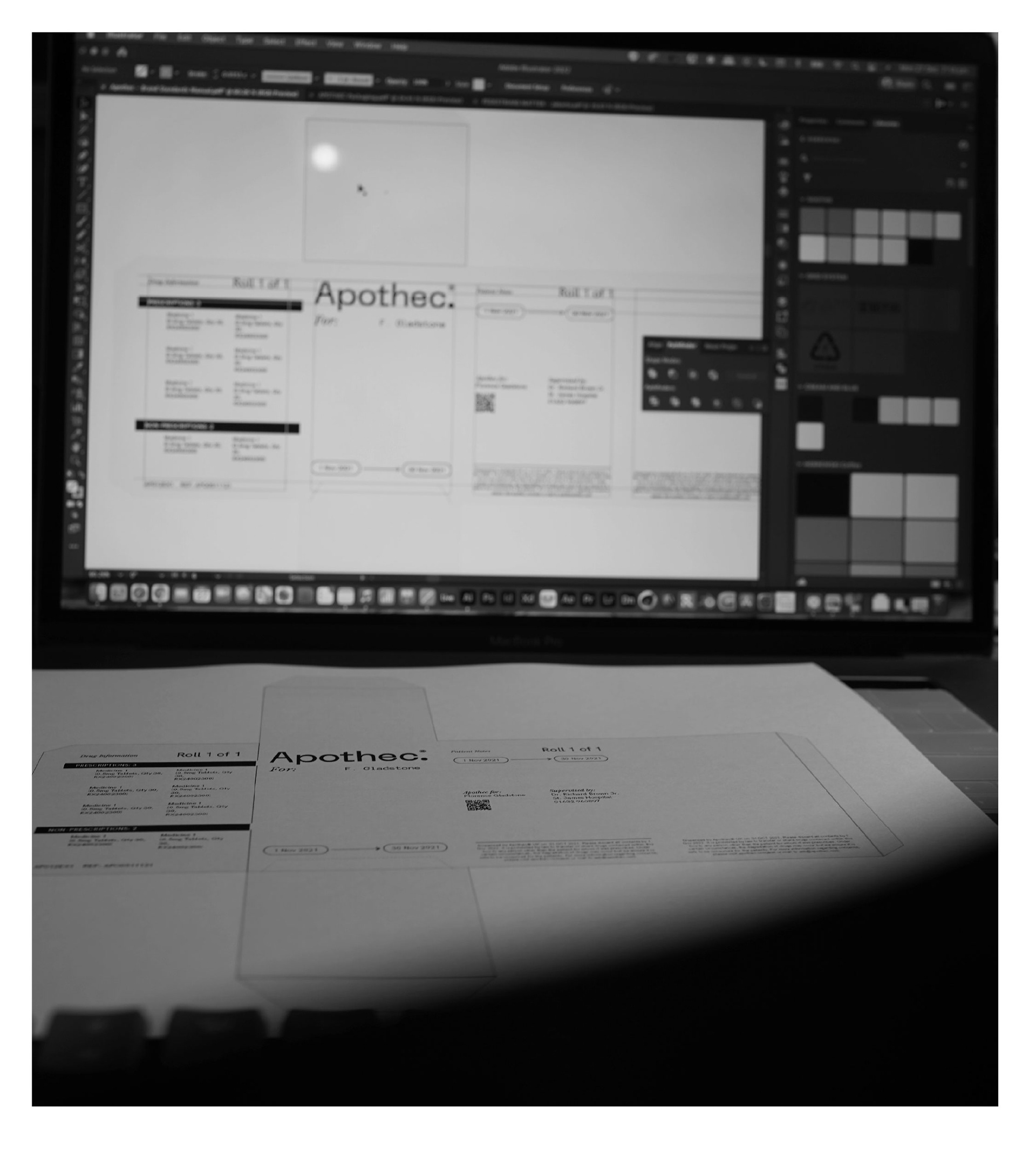
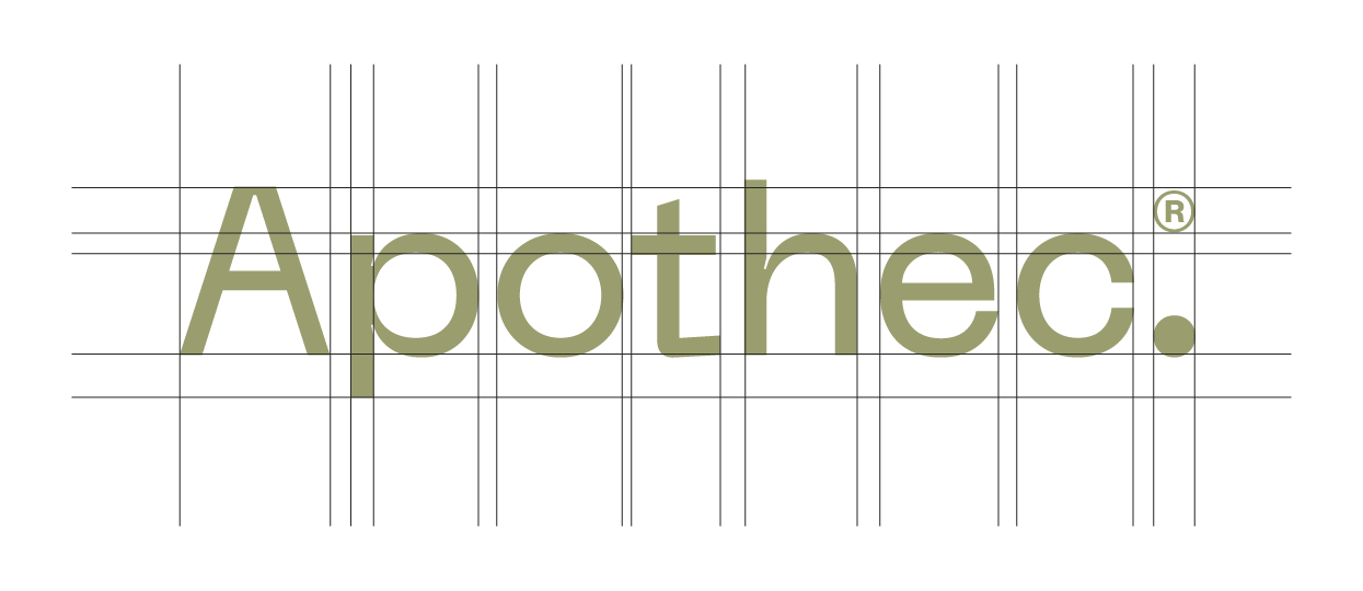
The creative direction is clean, minimalistic and slightly brutalist. For most packaging where legibility is critical (like the Apothec® box and the Apothec® roll, Tuatara black text is used on white (for maximum legibility). Typeface The typeface used for heading and logotype is “Space Grotesk Mono” by Florian Karsten. In certain situations where a particular text needs to be emphasised or italicised, “Libre Baskerville Italic” is used. For body text and fine prints, Apothec® uses “HK Grotesk” by Hanken Design Co.
The visual research and reference use mostly clean design with high contrast between text to maximise legibility. The expected materials to be used for the medicine packs will be recycled materials where possible, taking sustainability into consideration and learning.
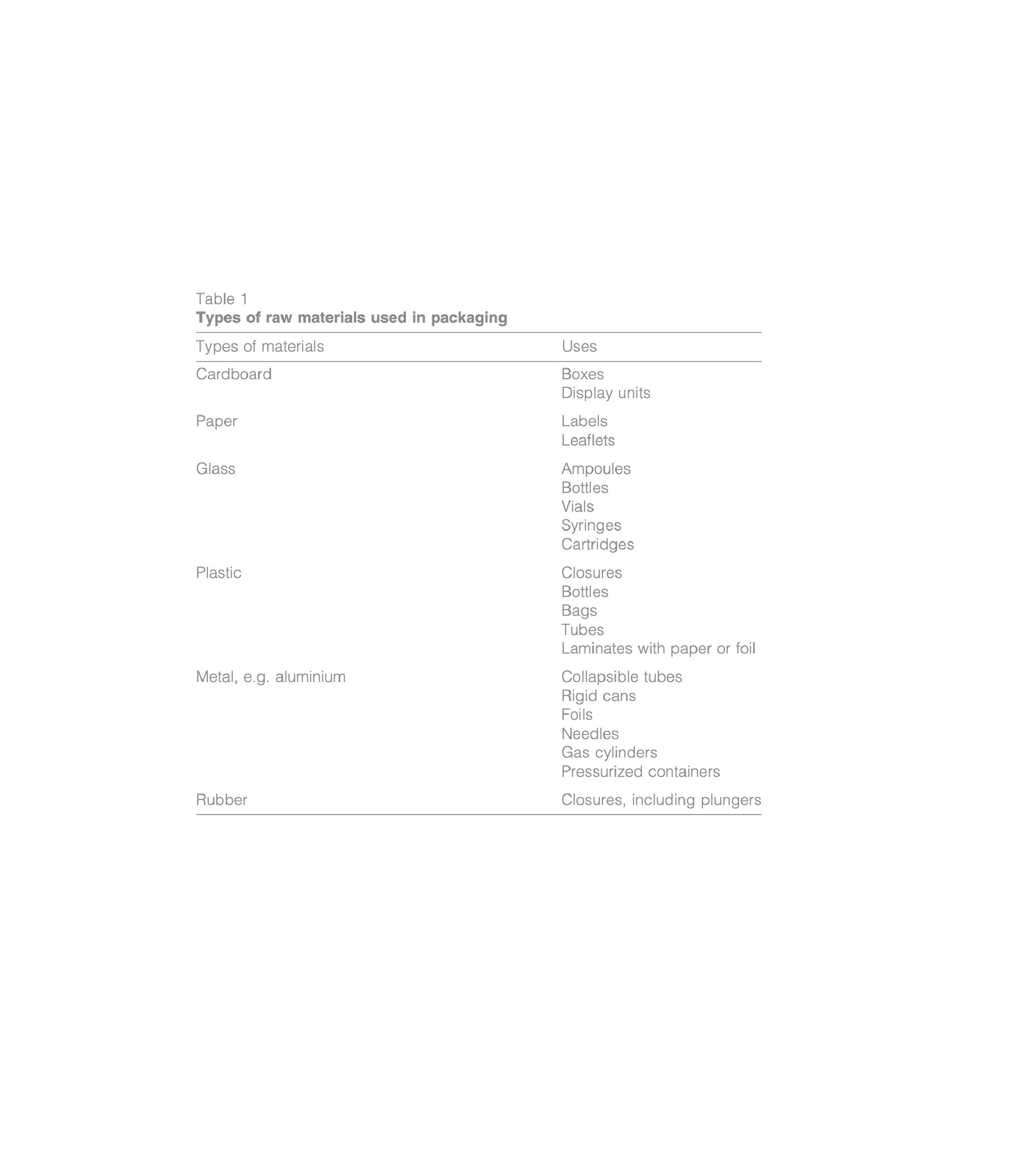
Materials - All materials used follow the guidelines for stability testing of pharmaceutical products release by the World Health Organisation. The box uses an organic thick paper, the Apothec roll uses a type of organic “plastic” made of cassava (that is proven to be neutral and non-contaminant towards pills and medications) and acts as a perfect and efficient vessel, the outer shipping box is made of corrrugated cardboard for protection.
Apothec Packaging showing the tear-away roll of dosed medicines
Website design overview
pieces of research

